Basics of Graphic Design
Whatever mode and medium you choose to market your program, your message will be enhanced by visually appealing design. But you don’t need to be a graphic designer! First, we encourage you to use MOD services to design your marketing materials. However, if you don’t have enough lead time for a MOD project or you just want to try to create your own materials, there are some basic principles of graphic design you should keep in mind.
Gestalt Principles
Gestalt principles are based on concepts of how a person’s mind perceives visual material and organizes it to make sense. We are doing this all the time without realizing it, but we can also use these principles for effective design. There are many Gestalt principles, but here are a few of the most common ones:
1. Closure: We prefer complete shapes, so our minds will automatically fill in gaps.

Closure is why we see the IBM logo forming the letters I, B, and M.
2. Common Region: We group elements in the same closed region together.
![]()
We perceive this continuous line of circles as two groups because of the boundaries creating closed regions around the circles.
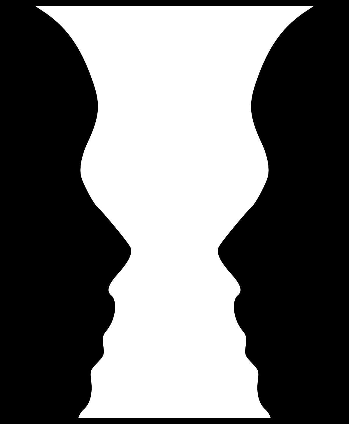
3. Figure/Ground: We look for solid, stable items and separate background from foreground.

Silhouette images such as this (two faces or a vase?) play with our figure/ground perceptions.
4. Proximity: We group items that are closer together as a unit.

We perceive these as two groups because of the proximity of the circles in each set.
5. Similarity: We build relationships between similar elements.
⚫ 🔴 ⚫ 🔴
⚫ ⚫ ⚫ ⚫
🔴 ⚫ 🔴 🔴
⚫ 🔴 🔴 🔴
We group the black circles together and red circles together, regardless of actual location, because of similarity.
6. Continuity: We perceive a line or curve as a continuous flow.

We perceive two wavy lines that intersect.
7. Focal Point: Whatever stands out visually will capture the viewer’s attention first.
⚫ ⚫ ⚫ ⚫ 🔴 ⚫ ⚫
One of these things is not like the others…and that’s what we see first.
Keep It Simple
Graphic design is essentially a process of organizing information visually. Especially in marketing, your design should help people understand your message. Non-designers sometimes want to use as many visual cues as possible to signify importance. However, trying to emphasize everything means that nothing is emphasized.
This isn’t to say that simple has to be boring. But make choices to use your design elements most effectively.
- Color: Consider creating a color palette, using colors that are analogous (close to each other on the color wheel) or complementary (opposite on the color wheel)
- Be sure to check on color contrast, especially for text, and visibility of your design to people with color blindness.
- Fonts: A very common design rule is to stick with one to two fonts (although variations within the same font family can be useful).
- Balance readability with style. Most of the time, ornate fonts are difficult to read. These can be used sparingly, but most information should be in a more readable font, usually sans serif.
- Hierarchy and Importance: A number of different design concepts can help with emphasis and organizing information, in addition to color and font:
- Scale and size
- Alignment
- White/blank space
- Contrast
- You can also use these elements together with the Gestalt principles to create emphasis. For example, All of your elements can be aligned, with one out of alignment to create a focal point.
- Icons and Geometric Shapes: Use lines to create order and icons to support your message.
Sources:
https://blog.snappa.com/graphic-design-tips/
https://www.freepik.com/blog/12-graphic-design-tips-non-designers/
https://www.interaction-design.org/literature/topics/gestalt-principles
https://www.usertesting.com/blog/gestalt-principles
More from the Marketing Toolkit
What is Marketing?
The Marketing Mix
Understanding Your Audience
Media Options
>Basics of Graphic Design
Social Media

